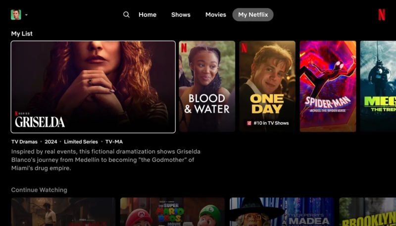
Netflix is testing a redesigned version of its Apple TV app, reports The Verge. The revamp marks the first major redesign of the Netflix app in quite a few years. The report says the new design is a notable departure from the current app’s design.
The new app’s navigation experience is designed to cut down on the “eye gymnastics” of users, who were looking all around to different parts of the Netflix home scree while attempting to find a show or film to watch.
“We really wanted members to have an easier time figuring out if a title is right for them,” Netflix senior director of product Pat Flemming told The Verge.
The refresh gets rid of the pop-out menu on the left side of Netflix’s homepage, replacing it with a more streamlined selection of options at the top of your screen: search, home, shows, movies, and My Netflix. Users will no longer need to scroll to the top of Netflix just to get to the new menu they will simply press the back button on their remote.
The new menu pares down some of the options previously available in the left-side menu as well, including the “Categories,” “New & Popular,” and “My List” tabs.
The static tiles for TV shows and movies are being replaced with tiles that extend when the remote lands on them, making information like the trailer and description more centralized.
Hovering over a TV show or movie for an extended period will cause a short preview to play.
The new design is currently being tested with a small group of subscribers, and testing will be expanded in the coming months if the change proves to be a popular one.


