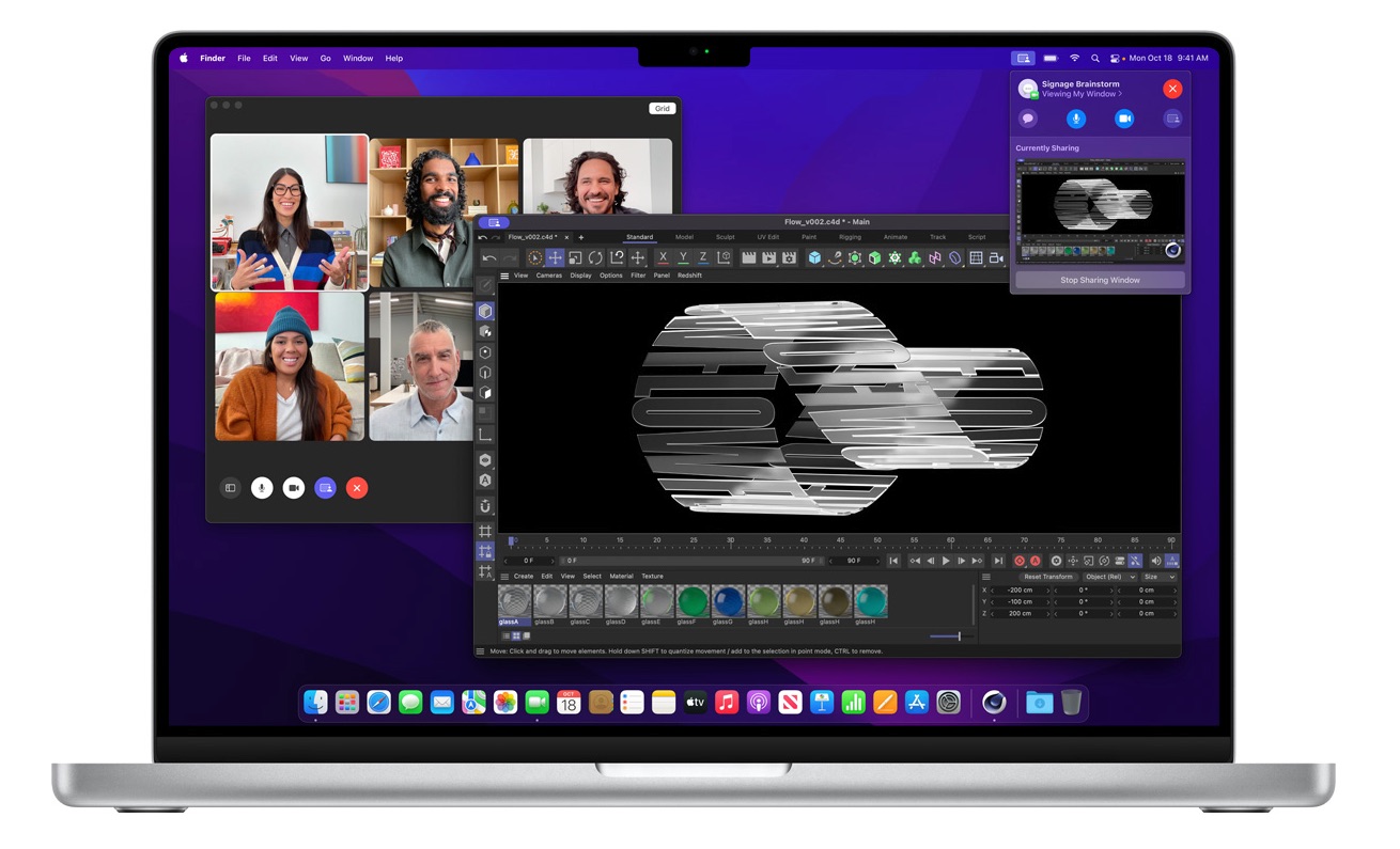

An Apple manager has said during a recent interview that the notch on the newly revamped MacBook Pro offers a “smart way” to give users more room for their content, thanks to the new Mac’s smaller screen bezels,
During an interview on the Same Brain podcast, Shruti Haldea, a manager for the Mac product line and one of the presenters during last week’s Apple event, said that the notch is a “smart” solution for the Mac as it provides users more room for their content by moving the macOS menu bar out of the way.
What we’ve done is we’ve actually made the display taller. Like on the 16-inch notebook, you still have a 16.0 active area on the diagonal in that 16:10-inch window, and we just grew the display up from there and put the menu bar up there. We just kind of moved it up and out of the way. So it’s a really smart way to give you more space for your content, and when you’re in full-screen mode, you have that 16:10 window, and it looks great. It’s seamless.
The new 14-inch and 16-inch models do feature significantly smaller bezels. Apple says the bezels are 24% thinner than the previous generation on the left and right sides of the display, measuring only 3.5mm. On the top, thanks to the notch, the bezel is 60% thinner, also measuring in at 3.5mm.
While the screen notch is certainly noticeable at first, Apple is betting that users will soon come to accept it, much as they have the iPhone’s screen notch. Apple has included some features in macOS to help minimize how noticeable the notch is. When macOS apps are full screen, macOS adds a black border to the top of the display to hide the notch.
(Via MacRumors)