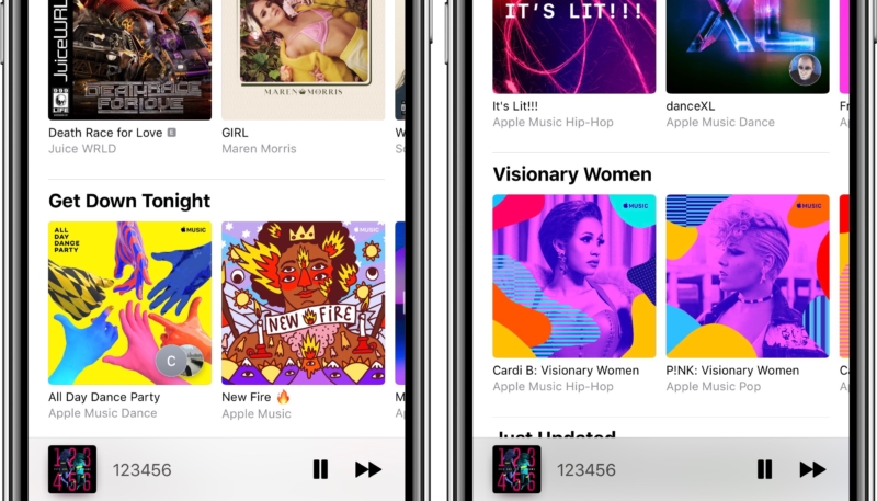
It’s been over 3 years since the introduction of Apple Music, and in that time, the look and feel has seen dramatic changes, as well as smaller updates. In the early days of the service, many of the most desired sections were relegated to small lists, redundant menus, or buried several taps deep into the UI.
Since the introduction, much has changed, but one section remained trapped between the old and new Apple Music experiences. Today, that changed. A server-side update last night, which is slowly rolling out to users around the world, brings the more curated, highly visual design to the apps “Browse” tab.
The emphasis of the update is on making it faster and easier to start exploring the latest or hottest music. Some of the update is geared toward simplified discovery, with a variety of sections for top songs, themed playlists, new music, and hot tracks.
The curation is another key feature to the updated browse section. Much like the curated experience of the “For You” section, “Browse” now also surfaces a larger collection of playlists and has rearranged some of the sections for more clear discovery.
When Apple Music was introduced in 2015, it was presented as a human curated steaming service, making music discovery better than the competitors. After a rocky start, the service really started to hit its stride with discovery in 2016, adding some personalization to the “For You” section.
Since then, Apple has quietly made occasional server-side updates to the platform, enhancing the look and feel or introducing new sections. Todays update to the Browse section is another example of Apple quietly working to improve the service for users.
With Apple’s ever prevalent push into services, it’s good to see them continuing to improve the experience of their existing products. The updates to the Browse section can be seen on iOS and macOS. We have not been able to confirm the changes on tvOS, but expect the updates will be visible there as well.
We’ll likely hear more about Apple Music on Monday, as Cook and company takes the stage of the Steve Jobs Theater to discuss their anticipated news and tv subscription services. It’s also likely that we’ll also see updates to the design and experience of the TV app, which most agree is in need to some attention.


