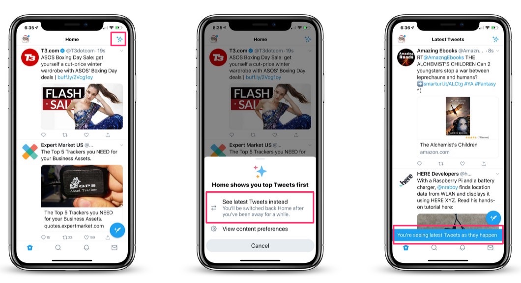

Twitter has been rolling out an update to its iOS app that you should now be seeing. The app’s new “Sparkle” button allows users to switch between the app’s default algorithm-based timeline view, and a chronological timeline view.


By tapping the “Sparkle” icon, found in the upper right-hand part of the screen when viewing your Twitter timeline, users have the opportunity to view their feed’s timeline in chronological order, instead of in Twitter default view.
The button doesn’t switch the view permanently, but apparently, the more you use it, the longer the app wi keep your feed in chronological order. So keep tapping.
The new timeline feature is personalized. As you tap to switch between the two modes, Twitter will learn your preferences. For example, if you switch to latest tweets more often, Twitter will keep you in the chronological view for longer. But, at least at first, Twitter may occasionally revert your timeline back to algorithmic view.
During testing, Twitter found that users “enjoyed Twitter more” after using the sparkle shortcut to switch to a chronological timeline.
The company’s lead of consumer product, Keith Coleman, said that during the test, people who used the icon to switch “enjoyed Twitter more” and participated in more conversations.
Currently, the Sparkle button is available only in the iOS app. However, Twitter says the button will be rolling out to the Android app “in the next few weeks.”
The Twitter is app is free, and is available for iOS devices in the App Store. [GET IT HERE]