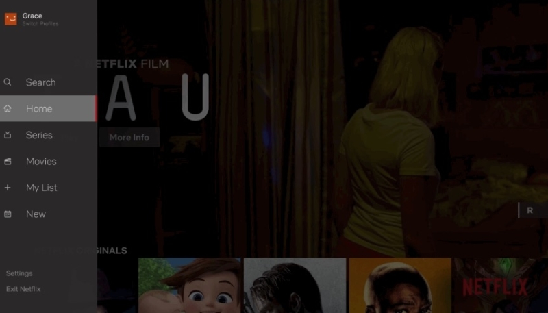
Netflix on Wednesday announce the upcoming release of its revamped TV applications. A Netflix blog post says the new interface was based on extensive research and testing involving how the streaming provider can make it easier to find titles on TV apps.
The new TV interface was designed to make the Netflix experience simpler and more intuitive in a few different ways. First, it is now easier to search and view new content added to the service. It is also far simpler to start browsing with either a series or movie; our research has shown us that while a member generally isn’t sure what exact title they want to watch, they have a pretty good sense of whether they are in the mood for a quick series episode or a longer movie experience. We’ve also made it easier to access titles you’ve saved for later viewing in My List. In our testing of this new interface, we saw that that this simpler design helped members find something great to watch.
The new interface design is intended to make it easier to switch between TV series content and movies. A new slide-out navigation pane offers a search option, as well as options for movies, series, new content, the user’s list, or to return to home.
Netflix didn’t specify which platforms would see the update, or when the update would begin showing its face to viewers. While the streaming giant didn’t specifically mention the Apple TV in the announcement, it does like to keep the interface of its app consistent across various platforms, so it is likely the new interface will hit the Apple TV in the near future.


