 Magazine style apps on the iPad continue to amaze me. Apps like Flipboard, The Daily, and now Feedly accentuate the iPad’s standing as a better reading experience than magazines, newspapers, and books.
Feedly today launched Android and iPad apps. Naturally, we’re taking a look at the iPad app!
You can download the app for free from the App Store.
Feedly grabs your Google Reader subscriptions and delivers them in a magazine-like format on the iPad. You can quickly skim and browse content from sites that you are subscribed to by swiping through the home screen and by using a permanently positioned menu in the footer area of the app.
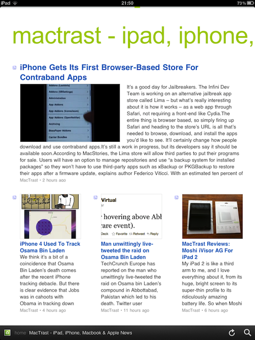
The design of Feedly is superbly minimal – as it should be. The app uses plenty of white space, padding, and simple text formatting to highlight content. Feedly presents a distraction free reading experience on your iPad.
Feedly uses a number of different templates for presenting content. Sometimes four articles are presented on the homepage of each subscription page, with the latest post taking half of the screen real-estate, and the next three posts featured below in a 3 column design. You can touch and swipe to move to page two of your subscription where you are presented with either 7 or 8 posts in a 2 column layout. The second column sometimes contains a square advert and recommendations for other sites that you may be interested in. Clicking on one of the subscriptions will bring you to a page featuring that sites’ news but unfortunately there is no way to add that site to your subscriptions, you can only browse its articles.
Clicking anywhere on an article (its image, headline, or introductory paragraph) will load up the article in a full view.
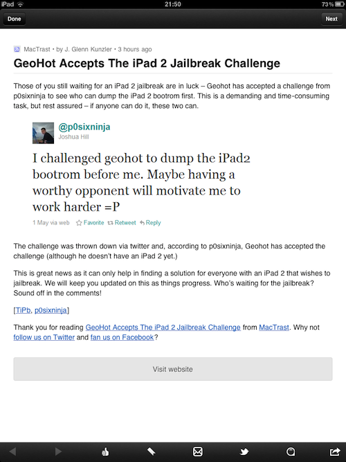
The full view for posts is a single column design with an option under each post to visit the website to view in a browser. Feedly uses its own built-in browser and it acts just like Safari would. Been able to click through to view an article on the site is handy as it allows you to also read the comments on a post. It would be nice if Feedly could pull in comments or show you how many comments the article has received. This would greatly add to the “readability” of Feedly and give you a more immersed reading experience.
Within each single post you can like, save, email, tweet, change the formatting of the post for mobile purposes, copy the URL of the post, and open the post in safari. You can also swipe right and left to navigate to the next posts in the subscription. Exiting out of the single view will return you to the feed subscription.
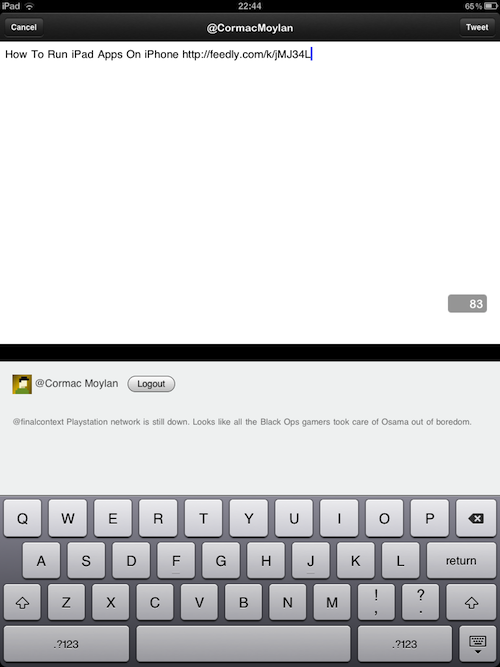
The Twitter integration in Feedly is superb. Clicking the Twitter icon will prompt you to login using your Twitter credentials. From thereon-in you can quickly post a link to the article you are reading from within Feedly. The tweet feature will also allow you to modify the headline and text of the tweet before pushing it out to Twitter.
Social integration with Facebook is planned for a 3.0 release.
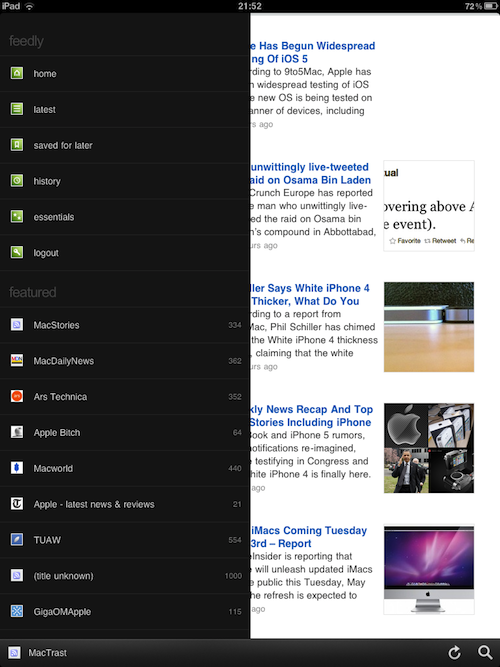
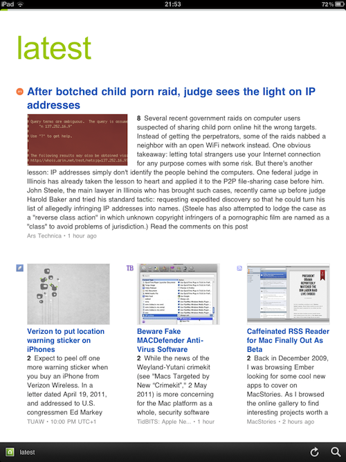
Other great features of Feedly include their latest, history, and essentials posts features. Clicking on latest will display all of your feeds in chronological order. While history will show you the feeds that you recently accessed. Essentials [write better]
Feedly 2.0 is only available in portrait view on the iPad. Turning the screen to a landscape view will not have any effect on the app. However, support for a landscape view is coming in version 3.0.
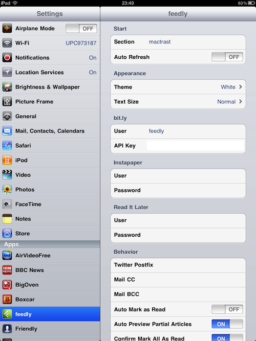
Within Feedly’s settings you can increase the text size of the content, choose a black background instead of a white one (doesn’t look nice in black), add your Instapaper, Bit.ly, and Read It Later accounts, and make a few other minor alterations to behaviors within the app.
The Verdict: I’m very impressed with Feedly. The simple and clear design brings out the content and makes the content extremely readable. But it does have some simple shortcomings, such as no landscape view or Facebook integration (both coming in version 3). I would also like to see comments introduced into the app in order to provide a fuller reading experience.
Feedly is the best traditional RSS reader I have used on iPad and I’m pretty excited to see version 3.0.
You can download the app for free from the App Store.
Rating: 4/5
PROS
- Free and uses nonintrusive ads
- Clean and elegant design
- Great Twitter integration
- Synchronization with Feedly.com
- Does RSS brilliantly
CONS
- Little bit buggy in parts
- No landscape view – only portrait


